Talking Carlton Index Lochie O'Brien Kerryn Harrington Lochie O'Brien Kerryn Harrington CFC Home CFC Membership CFC Shop CFC Fixture Blueseum
It is currently Fri Jun 20, 2025 8:05 pm

All times are UTC + 10 hours


Post new topic Reply to topic  [ 68 posts ]  Go to page 1, 2, 3, 4  Next
Author Message
 Post subject: Carlton T-Shirt Design
PostPosted: Mon Aug 30, 2010 11:49 pm 
Offline
Rod Ashman
User avatar

Joined: Fri May 05, 2006 2:02 pm
Posts: 2826
Location: melbourne
Hey guys, a couple days ago I mocked up some quick designs for a very simple Carlton FC t-shirt. Based on a shirt the New York Yankees have that celebrates past and present players. I was quite taken by these shirts when I saw them, with the famous NY logo on the front and names like Mantle, DiMaggio, Ruth, Gehrig et al next to the present day names of Jeter, Riviera, Rodriguez, etc.

The shirts are very simple, very comfortable and a great way of supporting the club. There could be a selection of present players, and as time goes by a poll on the club website could determine further releases. The first run could be a Captains one, then Premiership heroes and so on, so forth.

My idea is that they're $40-$50, which is a price point enticing enough to be an impulse buy. They're designed to either inspire nostalgia, harking back to the days of the duffle coat, or celebrate our current crop.

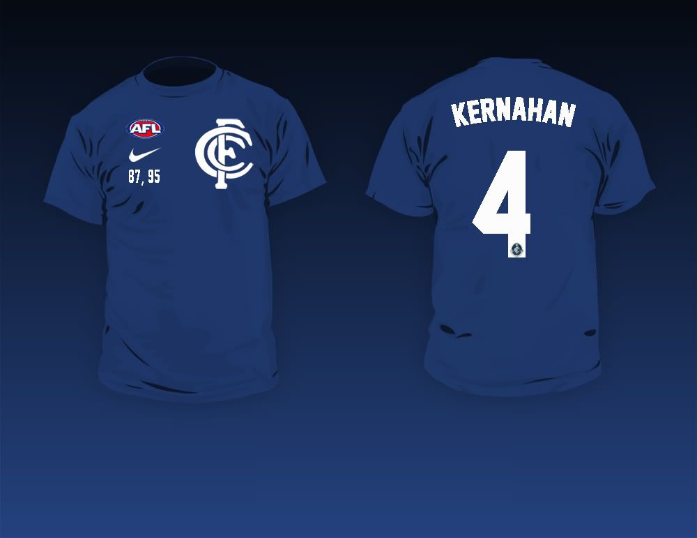
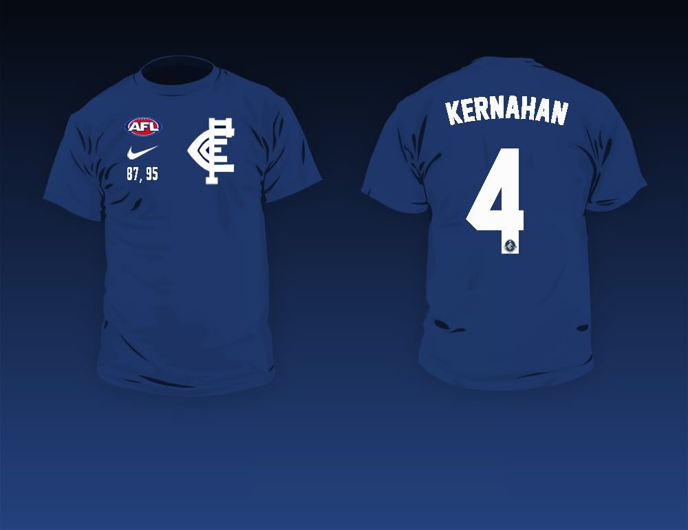
These are revised templates for the shirts, using Kernahan as an example.

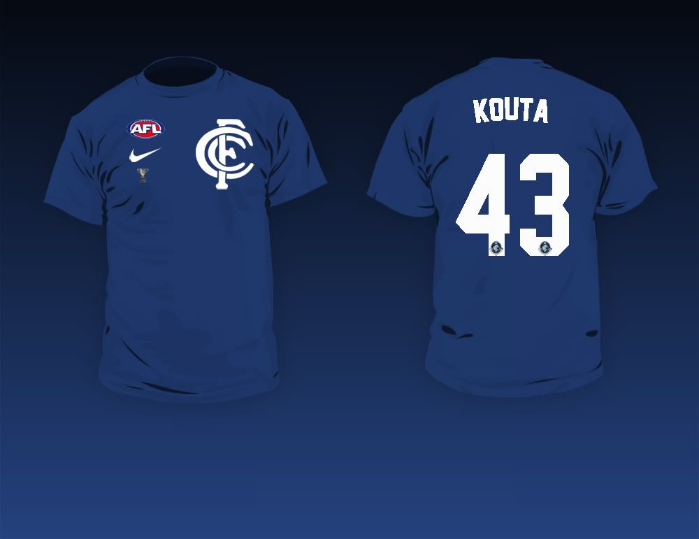
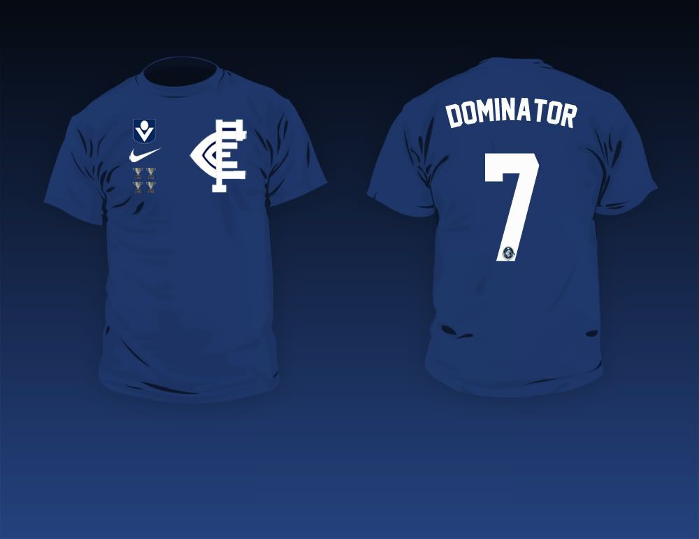
I think it a nice touch that in celebrating players from another era their shirts feature the monogram they wore during their careers. As such Kernahan would have the old one, whereas Judd would have the new one.

The numbers on the front denote premierships that player featured in (this could become something else, like little cups or whatnot).

I'd like to send the templates off to the club as a merchandise suggestion (not sure how far it'd get) but if people like it thats a start, isn't it. I was hoping to use this forum as a sounding board of sorts, with suggestions from you all helping to form a final design.

Thanks

Image

Image

_________________
"In fairness it did seem in the early days of the draft teams would just pick a name totally at random out of a hat. I'm pretty sure we picked James Cook at #2 one year. The mediocre forward, not the explorer" - Me, 12/9/2011

Carlton 2012: Lets remind them why they once feared the Dark.


Top
 Profile  
 
PostPosted: Mon Aug 30, 2010 11:52 pm 
Offline
Alex Jesaulenko
User avatar

Joined: Sat May 23, 2009 8:30 pm
Posts: 23921
great work Sean.
A V-neck might be nice for the gals?

_________________
That’s not a political statement — it’s a harsh reality, and we must act,” she said. “He is a clear and present danger to the things that keep us strong and free. I support impeachment.”


Top
 Profile  
 
PostPosted: Mon Aug 30, 2010 11:55 pm 
Offline
Bruce Doull
User avatar

Joined: Mon Feb 28, 2005 12:04 pm
Posts: 48543
Location: Prison Island
could 87,95 etc go on the left sleeve?

but better than most of our merchandise

i was gonna start a merchandise ideas thread but didnt

the caps have to change to the flexfit ones as well ala yankees caps

_________________
*(grow - fun - gah) :fight:

Yeah but whatabout your whataboutism.


Top
 Profile  
 
PostPosted: Tue Aug 31, 2010 12:55 am 
Offline
Mike Fitzpatrick
User avatar

Joined: Tue Mar 01, 2005 4:22 pm
Posts: 4678
Location: Melbourne
I love it!


Dude......... i'd but one (provided it says #43 of course!)

_________________
"We are what we repeatedly do. Excellence, then, is not an act, but a habit"
- Aristotle


Top
 Profile  
 
PostPosted: Tue Aug 31, 2010 1:04 am 
Offline
Rod Ashman
User avatar

Joined: Fri May 05, 2006 2:02 pm
Posts: 2826
Location: melbourne
ryan2000 wrote:
I love it!


Dude......... i'd but one (provided it says #43 of course!)


Like this....

Image

Choosing Kouta's monogram is a tough one, went with the new one for the sake of this design.

Added the cup in place of years, also.

_________________
"In fairness it did seem in the early days of the draft teams would just pick a name totally at random out of a hat. I'm pretty sure we picked James Cook at #2 one year. The mediocre forward, not the explorer" - Me, 12/9/2011

Carlton 2012: Lets remind them why they once feared the Dark.


Top
 Profile  
 
PostPosted: Tue Aug 31, 2010 2:46 am 
Offline
Mike Fitzpatrick
User avatar

Joined: Tue Mar 01, 2005 4:22 pm
Posts: 4678
Location: Melbourne
seanpb wrote:
ryan2000 wrote:
I love it!


Dude......... i'd but one (provided it says #43 of course!)


Like this....

Image

Choosing Kouta's monogram is a tough one, went with the new one for the sake of this design.

Added the cup in place of years, also.


I have a stiffy now........................... :oops:


Great Stuff!

_________________
"We are what we repeatedly do. Excellence, then, is not an act, but a habit"
- Aristotle


Top
 Profile  
 
PostPosted: Tue Aug 31, 2010 2:57 am 
Offline
Vale 1953-2020
User avatar

Joined: Wed May 11, 2005 1:23 am
Posts: 11671
The 43 would be a great one,, except how would you fit 70, 72, 79, and 81 on the front right?

_________________
Never argue with idiots. They drag you down to their level and then beat you with experience!!!

After Monday and Tuesday, even the calendar says W T F .........
Visit http://fromthemoshpit.com/


Top
 Profile  
 
PostPosted: Tue Aug 31, 2010 6:37 am 
Offline
Geoff Southby
User avatar

Joined: Wed Mar 30, 2005 3:54 pm
Posts: 5274
Location: Melbourne
They look really good, maybe they could be made in a hoody as well?

_________________
"We used to sit around and talk about how bad the game plan was." Anthony Koutoufides


Top
 Profile  
 
PostPosted: Tue Aug 31, 2010 6:37 am 
Offline
Stephen Silvagni
User avatar

Joined: Fri Aug 15, 2008 6:46 am
Posts: 28227
They look good, however, I'm tipping the club would prefer you to incorporate their major sponsors logos somewhere. :wink:


Top
 Profile  
 
PostPosted: Tue Aug 31, 2010 7:34 am 
Offline
Horrie Clover

Joined: Mon Feb 28, 2005 9:07 am
Posts: 329
I like the design, except i'd prefer to wear a T shirt without the Players name or number on the back.


Top
 Profile  
 
PostPosted: Tue Aug 31, 2010 8:35 am 
Offline
Alex Jesaulenko
User avatar

Joined: Tue Mar 08, 2005 10:14 am
Posts: 22357
Phoenix wrote:
I like the design, except i'd prefer to wear a T shirt without the Players name or number on the back.


I think that you are defeating the purpose of the shirt.

_________________
dane's trolling again


Top
 Profile  
 
PostPosted: Tue Aug 31, 2010 8:36 am 
Offline
Alex Jesaulenko
User avatar

Joined: Tue Mar 08, 2005 10:14 am
Posts: 22357
Take that shit-house AFL logo off it. IMO.

_________________
dane's trolling again


Top
 Profile  
 
PostPosted: Tue Aug 31, 2010 8:37 am 
Offline
Alex Jesaulenko
User avatar

Joined: Tue Mar 08, 2005 10:14 am
Posts: 22357
TheGame wrote:
They look really good, maybe they could be made in a hoody as well?


:thumbsup: :thumbsup: :thumbsup:

_________________
dane's trolling again


Top
 Profile  
 
PostPosted: Tue Aug 31, 2010 9:00 am 
Offline
Geoff Southby
User avatar

Joined: Sat Jan 20, 2007 2:57 pm
Posts: 5338
Location: Melbourne
[quote="dane"]Take that shit-house AFL logo off it. IMO.[/quo

:thumbsup: :thumbsup:

_________________
James Hird and Essendon* FC - #FOREVERDRUGCHEATS


Top
 Profile  
 
PostPosted: Tue Aug 31, 2010 9:05 am 
Offline
Bob Chitty
User avatar

Joined: Mon Jul 13, 2009 10:02 am
Posts: 885
Location: Where do you think i am??
TheGame wrote:
They look really good, maybe they could be made in a hoody as well?


Fantastic idea!!!

I love hoodie's.

_________________
When you're a Jet you're a Jet all the way!


Top
 Profile  
 
PostPosted: Tue Aug 31, 2010 9:25 am 
Offline
Rod Ashman
User avatar

Joined: Thu Dec 03, 2009 11:24 am
Posts: 2416
Location: Melbourne
Wow, these are really neat. Would definitely buy the Kernahan one. :thumbsup:

_________________
Premierships: 1869, 1871, 1873, 1874, 1875, 1877, 1887, 1906, 1907, 1908, 1914, 1915, 1938, 1945, 1947, 1968, 1970, 1972, 1979, 1981, 1982, 1987, 1995.

"GIBBS."


Top
 Profile  
 
PostPosted: Tue Aug 31, 2010 9:39 am 
Offline
Garry Crane

Joined: Mon Jan 21, 2008 7:12 am
Posts: 218
Location: Melbourne
dane wrote:
Take that shit-house AFL logo off it. IMO.


Agreed, would look much better without the AFL logo.

Other than great work Seanpb


Top
 Profile  
 
PostPosted: Tue Aug 31, 2010 9:39 am 
Offline
Geoff Southby

Joined: Sun Feb 27, 2005 1:29 pm
Posts: 5913
Location: Melbourne
Good work sean.

In a perfect world, you'll kill the AFL and Nike logo because they do nothing other than distract from the purity and clarity of the design, and just clutter it up. But fat chance of that happening I'd imagine. Love the touch with the CFC reflecting the era the player was in.

Hey, here's a thought: why don't you send your ideas to the communications department at the club? I'm sure they'd be really receptive to supporter-generated stuff like this :lol: :lol:


Top
 Profile  
 
PostPosted: Tue Aug 31, 2010 9:47 am 
Offline
Ken Hunter
User avatar

Joined: Sun May 23, 2010 9:02 pm
Posts: 13433
Location: Melbourne
Could the AFL and Nike logos go on the sleeve? Less obtrusive there. That way you could just have the CFC and the premiership years on the front.


Top
 Profile  
 
PostPosted: Tue Aug 31, 2010 12:27 pm 
Offline
Rod Ashman
User avatar

Joined: Fri May 05, 2006 2:02 pm
Posts: 2826
Location: melbourne
Hey, thanks for the replies.

I quickly put this one together for Johnno with a few more possible alterations.

I remembered to fix the type so it's smooth/crisp now. Not a massive issue, but at least it makes the mock-ups look better.

Image

So as you can see the possibilities and tweaks, however small, are endless really. I toyed with the various additions (logos, cups, Nike) on the sleeves and whilst perfectly fine, it leaves the shirt somewhat unbalanced at the front, like something is missing. I agree with the sentiments that in a perfect world it'd just be the Monogram and premierships, but knowing the licensing agreements the AFL logo will have to be on there in some way, shape or form.

With this one I thought it good to offer a point of difference with the VFL logo.

The hoody idea is a great one, there are decent vectors for those, but none that are quite good enough. I'd like it to be a proper jumper, not a zip up one, if you follow me.

_________________
"In fairness it did seem in the early days of the draft teams would just pick a name totally at random out of a hat. I'm pretty sure we picked James Cook at #2 one year. The mediocre forward, not the explorer" - Me, 12/9/2011

Carlton 2012: Lets remind them why they once feared the Dark.


Top
 Profile  
 
Display posts from previous:  Sort by  
Post new topic Reply to topic  [ 68 posts ]  Go to page 1, 2, 3, 4  Next

All times are UTC + 10 hours


Who is online

Users browsing this forum: Majestic-12 [Bot] and 19 guests


You cannot post new topics in this forum
You cannot reply to topics in this forum
You cannot edit your posts in this forum
You cannot delete your posts in this forum
You cannot post attachments in this forum

Jump to:  
Powered by phpBB® Forum Software © phpBB Group