Quote:
It's so gratifying to see the embracing of change on this site!
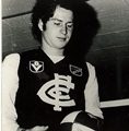
As one of the older generation on this site, I have fond memories of the old logo as we pounded teams during the '70's and '80's.
But it's time for a change, and I like what the club has done, and I do come from a marketing background. As I've written elsewhere, the committee has made few correct decisions during their time in office, but this one works for me.
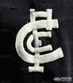
For starters, I like the new logo, as it has clean lines and does look balanced as far as I'm concerned, whereas the old crest version looks cumbersome, cluttered and dated.
More importantly, it's important to consider who the club is trying to capture with the new look, and I'd suggest it's not the people who visit this site. Carlton is looking to the younger generation who haven't committed to a club, and need to have a contemporary 'look'.
The 1980's version looked right for the decade, but I think would look out of place today, as it had an amateurish feel in keeping with the times. If we reversed the emblems and tried to introduce the '80's version today, it would be absurd.
Tradition is a cute little thing which gives us a warm inner glow, but is really a curse for those enslaved by it, as it makes any change severely compromised, and crushes progress in any form.
JW why do we see the change of the club logo as question of good design versus bad design?
Why do we scoff at tradition as being saomething that is dated and needs to be altered to reflect the f*&king here and now?
There should not have been any change to the logo simply to attract a younger generation, who clearly have not embraced the club much less the new logo as the drop in membership numbers clearly illustrates.
Is changing the logo going to mean that we are going to win more games? Doesn't seem to have had much of an impact there!
Win games and the younger generation will follow suit.
Change the logo and they don't give a damn.
The generation that the CFC is seeking is elusive and fickle and they also know that logo design change is purely a means to grab some cash for the club thru merchandise.