Well, it seems out logo has changed according to the new slogan header on the website.
The little bits on the C's (all I could think of was 'notches', or are they Serifs?) are GONE.
Personally, I don't like it.
Exhibit A: Notches that we know and love.

Exhibit B: Notchless underpants...
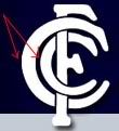
BRING BACK THE NOTCHES!
