A recent trip to NYC (including a night at Yankee Stadium) got me thinking anew about something that's been bugging me for a while.
The New York Yankees are lucky enough to have one of the cleanest, simplest and most recognized logos in world sport. But of course, they know this and protect it and milk it for all its worth.
Consider this: when a Yankees fan sees a photo of their greatest ever player, Babe Ruth, they see him proudly wearing the NY logo:
Attachment:
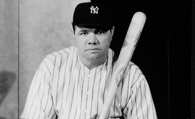 babe-ruth-the-sultan-of-swat_3.jpg [ 62.08 KiB | Viewed 46042 times ]
Sixty years on, and their current favourite player is Derek Jeter. And when they see Derek go out to bat, they see him proudly wearing the same logo that Babe Ruth wore all those years ago:
Attachment:
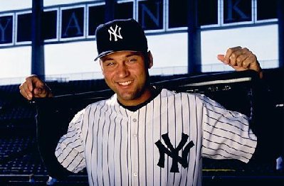 Derek-Jeter.jpg [ 30.22 KiB | Viewed 44614 times ]
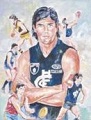
When you look at a photo or footage of arguably our greatest ever player, the great John Nicholls, you see him proudly wearing a logo that had all the power, symmetry and simplicity of the great Yankees logo:
Attachment:
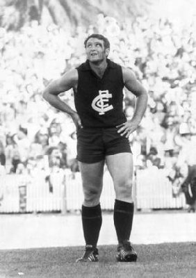 majnicholls_narrowweb__300x426,0.jpg [ 30.47 KiB | Viewed 44607 times ]
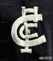
Forty years on, when we see our current favourite player, he's wearing a logo that is quite different:
Attachment:
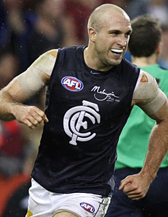 _JuddRd1109246a.jpg [ 23.52 KiB | Viewed 46037 times ]
The question is, why??
Why can one of the biggest, most professional (and profitable) sporting clubs in the world manage to keep their identity intact, and we can't?
Why did we feel the need to change our logo to allegedly 'modernise' it, when a team/brand as powerful and relevant and successful as the Yankees felt it appropriate to keep their identity the same as it ever was: the famous pinstripes, and the famous logo. Design like that never loses its appeal or its relevance.
The NY Yankees logo works on EVERYTHING, everywhere. They use it on merchandise, uniforms, the stadium, caps, memorabilia... everything. And it's a hell of a lot like the classic logo someone (more in this in a second) decided to phase out over a decade ago.
So... onto the WHO?
Who, exactly, decided to do this? Who thought it appropriate to throw out the key symbol that represented the MOST SUCCESSFUL PERIOD IN OUR CLUB'S HISTORY? Who, exactly, decided that the jumper Big Nick and Jezza and Kernahan and SOS and Bradley and all our other greats wore in those Grand Finals was no longer relevant?
I reckon it was the decision of a third-rate mind, and I also reckon changing the jumper to that degree should have been a very, very big deal. Not just something that was decided by some functionary at the club on a whim.
Pisses me off to think that we had a great symbol, and we threw it away for a far weaker version of the CFC, for no apparent reason or benefit.
I know there will be people who'll say "who cares... it's a carlton jumper and it's still the CFC..." and that's true. But it's only half the story. We had something great and we replaced it with something ordinary. We went from powerful and simple with a brutal elegance, to something weak, spindly and messy.
Yankees fans would burn the stadium down if the owner tried doing that (not that he'd be stupid enough), and rightly so. I tell you, if I was lucky enough to be born a Pratt, we'd be starting Season 2012 wearing the same logo that Carlton greats like Big Nick made famous.
But, of course, I'm just some guy ranting on a forum. So the whale-bones it is. Pity.