Talking Carlton Index Lochie O'Brien Kerryn Harrington Lochie O'Brien Kerryn Harrington CFC Home CFC Membership CFC Shop CFC Fixture Blueseum
It is currently Tue Jun 24, 2025 9:17 pm

All times are UTC + 10 hours


Post new topic Reply to topic  [ 47 posts ]  Go to page 1, 2, 3  Next
Author Message
PostPosted: Tue Apr 03, 2007 8:45 pm 
Offline
Laurie Kerr
User avatar

Joined: Tue Mar 20, 2007 9:21 pm
Posts: 108
Location: noosa
The 'circumcision' of the traditional CFC monogram, is a real sore point with me. I'll declare my hand here. I am a designer, and my business is logo design, and I loved the traditional monogram.

The current logo on the Blues jumper is nothing more than a barstardisation of what, was, a fabulously designed mark. It was balanced, dynamic and loaded with personality. The ‘new’ logo has had the 'notches' removed, and to my eye, the elements look repositioned and unbalanced.

Last year I asked a Carlton Board Member just why the traditional monogram had been 'doctored'. He said that a colleague had moved a motion to 'modernise' the monogram. Their feeling was that the monogram had to be 'cleaned up' to reflect a new direction for the club. I asked if this person had any qualifications or experience in design and he said 'no, definitely not'. I put forward the argument that alterations to a valued home would require the experience of a qualified architect, yet some unqualified design novice think they can meddle with a brand, just because they sit on a board. He agreed and confessed that most of his colleagues preferred the 'old' monogram. He advised me to write to the club and point out their folly.

Imagine if some upstart at Coca Cola said, "hey, dude, why not get rid of all those unnecessary swashes. It looks so old fashioned. It needs to look modern. Look at Pepsi". There are some basic tenants of effective logo design, and the big one is being distinctive. In a recent survey the Coke logo was identified as one of the most recognisable logo designs in the world. Yet, it was conceived over one hundred years ago.

I would really like to hear the club's logic in adopting the 'new' monogram, and get them to identify the nob who changed what was a totally functional and distinctive logo that needed no any surgery at all.


Top
 Profile  
 
 Post subject:
PostPosted: Tue Apr 03, 2007 8:58 pm 
Offline
Bruce Doull
User avatar

Joined: Mon Feb 28, 2005 12:41 pm
Posts: 63509
Nice post, johntall.

I agree, I also think it looks unbalanced and silly.

Bring back the notches!

_________________
And so while others miserably pledge themselves to the pursuit of ambition and brief power, I will be stretched out in the shade, singing.


Top
 Profile  
 
 Post subject:
PostPosted: Tue Apr 03, 2007 9:01 pm 
Offline
Alex Jesaulenko
User avatar

Joined: Sat Feb 26, 2005 9:00 am
Posts: 23123
This is the fifth variation on the monogram that the club has used and it will not be the last.

Everytime something is changed on the jumper there are always outcries, but once a few games are won in a new design they quieten down pretty quiickly.

I remember doing some Blueseum work a few months ago and reading an Argus article from about 1906 where the Blues were running out with a new design element on the guernsey. I laughed when I read about all the 'tut-tutting' about the new design and about how they should not mess with tradition etc. :lol:

I love the old monogram too, but mainly because I associate it with so much success. This club should be about moving forward now, going back to a previous design would be going backwards IMO.

_________________
|♥♥♥♥♥♥| http://www.blueseum.org |♥♥♥♥♥♥|


Top
 Profile  
 
 Post subject:
PostPosted: Tue Apr 03, 2007 9:04 pm 
Offline
Craig Bradley

Joined: Tue May 16, 2006 8:57 pm
Posts: 6836
i'd rather the monogram we're using now over the one we used in seasons 98-05 but i'd also rather the one we use as a heritage jumper that we'd used for close to 100 years and enjoyed almost all our success in the most.

_________________
Last edited by true_blue3 on Mon Sep 26, 1981 5:07 pm; edited 92 times in total


Top
 Profile  
 
 Post subject:
PostPosted: Tue Apr 03, 2007 9:07 pm 
Offline
Ken Hunter
User avatar

Joined: Mon Mar 20, 2006 11:55 pm
Posts: 12596
Location: Brisbane
Well expressed johntall. This topic has been aired before, but an important one nevertheless.

Why tradition has to go by the wayside just for the sake of 'moving forward' beats me.

I realise that the classic Carlton emblem was far from being the club's first, but blind Freddy could see that it has far greater impact than what we use now.

Bring back the old emblem, ditch Captain Carlton (why does a team Have to have a mascot?), and for God's sake, cement the words, 'THEY LIKE TO SEND UP' in place. :P

_________________
THEY LIKE TO SEND UP!!!!!!!!

Until each team plays each other the same number of times, the AFL, as a fair dinkum competition, cannot be taken seriously.

He (Mr Swann) said the honour and pride associated with the club's traditional navy blue jumper was priceless.


Top
 Profile  
 
 Post subject:
PostPosted: Tue Apr 03, 2007 9:16 pm 
Offline
Bruce Doull
User avatar

Joined: Mon Feb 28, 2005 12:41 pm
Posts: 63509
I think they should have used elements of our most successful logo, the 1929-97 one with an updated logo and produced something like this:
Image
It has much more strength, and balance, and the notches aren't an issue.

_________________
And so while others miserably pledge themselves to the pursuit of ambition and brief power, I will be stretched out in the shade, singing.


Top
 Profile  
 
 Post subject:
PostPosted: Tue Apr 03, 2007 9:39 pm 
Offline
Laurie Kerr
User avatar

Joined: Tue Mar 20, 2007 9:21 pm
Posts: 108
Location: noosa
Some of the worst design in the western world is perpetrated by football clubs. Just look at your typical 'pre-season' jumper designs (Hawthorn diamonds in the 90's), and even some 'away game' ones (Brisbane, St Kilda). How supporters tolerate such bad strips is beyond me. Who makes these decisions? Do footy clubs honestly think that fans are going to shell out for these abominations.


Top
 Profile  
 
 Post subject:
PostPosted: Tue Apr 03, 2007 9:56 pm 
Offline
Ken Hunter
User avatar

Joined: Mon Mar 20, 2006 11:55 pm
Posts: 12596
Location: Brisbane
johntall wrote:
Some of the worst design in the western world is perpetrated by football clubs. Just look at your typical 'pre-season' jumper designs (Hawthorn diamonds in the 90's), and even some 'away game' ones (Brisbane, St Kilda). How supporters tolerate such bad strips is beyond me. Who makes these decisions? Do footy clubs honestly think that fans are going to shell out for these abominations.


And what do you think of Carlton's clash strip? I think it looks bloody ordinary (it will also be worn with white shorts and white socks, won't it?), and again, simply no need for it. It would be interesting to know just how many players actually see a need for the clash jumper. Me thinks more likely another AFL money spinner.

_________________
THEY LIKE TO SEND UP!!!!!!!!

Until each team plays each other the same number of times, the AFL, as a fair dinkum competition, cannot be taken seriously.

He (Mr Swann) said the honour and pride associated with the club's traditional navy blue jumper was priceless.


Top
 Profile  
 
 Post subject:
PostPosted: Tue Apr 03, 2007 9:59 pm 
Offline
Bruce Doull
User avatar

Joined: Mon Feb 28, 2005 12:41 pm
Posts: 63509
bluedog wrote:
johntall wrote:
Some of the worst design in the western world is perpetrated by football clubs. Just look at your typical 'pre-season' jumper designs (Hawthorn diamonds in the 90's), and even some 'away game' ones (Brisbane, St Kilda). How supporters tolerate such bad strips is beyond me. Who makes these decisions? Do footy clubs honestly think that fans are going to shell out for these abominations.


And what do you think of Carlton's clash strip? I think it looks bloody ordinary (it will also be worn with white shorts and white socks, won't it?), and again, simply no need for it. It would be interesting to know just how many players actually see a need for the clash jumper. Me thinks more likely another AFL money spinner.


It can only be a money spinner if people pay for it. I know I won't.

_________________
And so while others miserably pledge themselves to the pursuit of ambition and brief power, I will be stretched out in the shade, singing.


Top
 Profile  
 
 Post subject:
PostPosted: Tue Apr 03, 2007 10:05 pm 
Offline
Laurie Kerr
User avatar

Joined: Tue Mar 20, 2007 9:21 pm
Posts: 108
Location: noosa
Is there much money in the alternative strips market?
Could a large retailer be flowered in stocking quantities of these jumpers?
Especially when the alternative jumpers change every year, it would seem. Maybe there is a hidden ecomony in bad design.


Top
 Profile  
 
 Post subject:
PostPosted: Tue Apr 03, 2007 10:09 pm 
Offline
Bruce Doull
User avatar

Joined: Mon Feb 28, 2005 12:41 pm
Posts: 63509
johntall wrote:
Maybe there is a hidden ecomony in bad design.


I guess there must be, in the sense of people being paid to come up with useless crap designs, the apparel manufacturers being paid for the goods, etc....

_________________
And so while others miserably pledge themselves to the pursuit of ambition and brief power, I will be stretched out in the shade, singing.


Top
 Profile  
 
 Post subject:
PostPosted: Tue Apr 03, 2007 10:22 pm 
Offline
Serge Silvagni

Joined: Tue Mar 08, 2005 12:06 pm
Posts: 939
Hi johntall.

Horrific avatar. :wink:

I started a thread a while ago on this very topic. It might interest you as it includes an official reply from Ian Coutts regarding the concept behind the 'new' design.

http://www.talkingcarlton.com/phpBB2/vi ... highlight=

I echo your sentiments exactly. It's just a plain bad job, and I'm surprised that it was ultimately okayed as the official logo.

Despite my best intentions I never replied to the club like I stated in the above thread. Maybe now is the time -- with a new and transparent board -- to air such thoughts about the logo?

Maybe a new poll could be started to gauge the percentage of for / against . . ?


Top
 Profile  
 
 Post subject:
PostPosted: Tue Apr 03, 2007 10:59 pm 
Offline
Bruce Doull
User avatar

Joined: Mon Feb 28, 2005 12:04 pm
Posts: 48548
Location: Prison Island
i like the new logo - my wife is a graphic designer and funnily enough thinks the old one is better too

i also like the clash jumper and have enough money to stupidly have already bought the replica and i will buy the authentic one too which apparently is 200 bucks !!!

its idiots like me that allow the merchandise juggernaut to roll on - i have every conceivable peice of carlton merchandise that exists

_________________
*(grow - fun - gah) :fight:

Yeah but whatabout your whataboutism.


Top
 Profile  
 
 Post subject:
PostPosted: Tue Apr 03, 2007 11:01 pm 
Offline
Harry Vallence
User avatar

Joined: Wed Mar 02, 2005 12:13 pm
Posts: 1830
Location: Fitzroy
Notches


Top
 Profile  
 
 Post subject:
PostPosted: Tue Apr 03, 2007 11:24 pm 
Offline
Laurie Kerr
User avatar

Joined: Tue Mar 20, 2007 9:21 pm
Posts: 108
Location: noosa
titimus wrote:
Hi johntall.

Horrific avatar. :wink:

I started a thread a while ago on this very topic. It might interest you as it includes an official reply from Ian Coutts regarding the concept behind the 'new' design.

http://www.talkingcarlton.com/phpBB2/vi ... highlight=

I echo your sentiments exactly. It's just a plain bad job, and I'm surprised that it was ultimately okayed as the official logo.

Despite my best intentions I never replied to the club like I stated in the above thread. Maybe now is the time -- with a new and transparent board -- to air such thoughts about the logo?

Maybe a new poll could be started to gauge the percentage of for / against . . ?


Hi Titimus, I read your past thread with interest, and appreciated everyones views.

I am surprised that Coutts wrote that letter to you as he was THE official I spoke to (see top of this post). No doubt he has to tow the company line.

I am not against change, but please give me good reasons.... and good design, to warrant change.

I question the motives of the person who pushed for the change to the 'new' logo. Reeks of self importance to me.

Postscript....
For the sake of my argument, it may pay to drop the term 'old' and use 'traditional' instead (even though the 'notched version' was only around for seven years). There is an misguided assumption that 'old' is the same as 'bad'.


Top
 Profile  
 
 Post subject:
PostPosted: Wed Apr 04, 2007 1:33 am 
Offline
Rod Ashman
User avatar

Joined: Fri Jun 24, 2005 12:30 pm
Posts: 2864
Kaptain Kouta wrote:
I think they should have used elements of our most successful logo, the 1929-97 one with an updated logo and produced something like this:
Image
It has much more strength, and balance, and the notches aren't an issue.


I have strong feelings on this, and have expressed them here before (and in my signature).

FWIW, I think that the laurel wreath logo should be, and always should be, the logo of the CFC. It's full of a hundred years of tradition, it is bold, distinctive, powerful, reeks of success and makes a statement to every other club that THIS IS CARLTON.

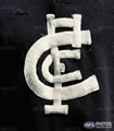
With regard to the CFC on the jumper, I like the one used from 1929-97, and don't mind the newer version WITH the notches.

I think the current version (without the notches) stinks, it looks weaker, and kind of looks like it's going to topple over (may have been very apt for the time period then!).

I must say, I actually really like the design that Kaptain Kouta has come up with on this thread...as he says, takes the best of both designs. Would be more than happy to see this on the jumper...combination of history and modern, well balanced, strong and powerful.

Johntall, I reckon now is a great time to get into the ear of the Club about this. Time to let them know that we, the members and supporters, whilst understanding the need to move forward, also understand (and demand) the need to respect and promote the history and tradition of the Club.

Maybe set up a poll on here asking 2 questions:

1. Which logo do people prefer to represent the Club in official matter, media etc? (ie old laurel wreathe, or current version), and

2. which CFC do people want on the jumper? (ie old style 1929-97, new style with notches, new style without notches, or Kaptain Kouta's design)

Then write a letter to Pratt, cc it to Swann, outlining the results.

_________________
Mens sana in corpore sano.

Bring back the laurel wreath logo!!!


Top
 Profile  
 
 Post subject:
PostPosted: Wed Apr 04, 2007 1:42 am 
Offline
Rod Ashman
User avatar

Joined: Fri Jun 24, 2005 12:30 pm
Posts: 2864
bluedog wrote:
And what do you think of Carlton's clash strip? I think it looks bloody ordinary (it will also be worn with white shorts and white socks, won't it?), and again, simply no need for it.


Bluedog, I reckon if it was worn with blue shorts and blue socks (which would surely not be a clash), it would actually look ok.

Prefer the traditional navy of course, but given that the Autocratic Football League has dictated that each club must have an alternative jumper, I thin it would look good WITH blue shorts and socks.

_________________
Mens sana in corpore sano.

Bring back the laurel wreath logo!!!


Top
 Profile  
 
 Post subject:
PostPosted: Wed Apr 04, 2007 8:00 am 
Offline
Rod Ashman
User avatar

Joined: Fri Mar 04, 2005 10:58 am
Posts: 2138
I MUCH prefer the 20's to 97 version of the jumper.

The main reason is that the logo was bolder, stronger and didn't have artsy fartsy gaps in it.

At the same time, I prefer the current version to the 97-05 version. Smoother and clearer lines at least. Also the lettering is a bit thicker and bolder.


Top
 Profile  
 
 Post subject:
PostPosted: Wed Apr 04, 2007 8:11 am 
Offline
Alex Jesaulenko
User avatar

Joined: Mon Feb 28, 2005 8:35 am
Posts: 20246
Location: 父 父 父 父 父 父
I couldn't agree more


Top
 Profile  
 
 Post subject:
PostPosted: Wed Apr 04, 2007 8:21 am 
Offline
Harry Vallence
User avatar

Joined: Tue Mar 01, 2005 11:23 am
Posts: 1797
Location: Half Back Flanker...
Agreed....storm the club, boys!!

_________________
"...that's the thing about opinion - you don't have to know anything to have one..." Andre Agassi commenting on Pat Cash 2004
"...the less you know - the more you believe..." - Bono 2006


Top
 Profile  
 
Display posts from previous:  Sort by  
Post new topic Reply to topic  [ 47 posts ]  Go to page 1, 2, 3  Next

All times are UTC + 10 hours


Who is online

Users browsing this forum: Cazzesman, Crusader, Google [Bot], Nick, The_Cranium and 20 guests


You cannot post new topics in this forum
You cannot reply to topics in this forum
You cannot edit your posts in this forum
You cannot delete your posts in this forum
You cannot post attachments in this forum

Jump to:  
cron
Powered by phpBB® Forum Software © phpBB Group