Skippers Blues wrote:
Kaptain Kouta wrote:
Personally it was the lazy, easy job. The "clash" jumper does nothing for our "brand" says less than nothing about the Club.
Just like the Board, the White jumper shows the lack of forward thinking and imagination endemic at PP at the moment.
Well what would you have had as the away strip then Kaptain Kouta? I agree i think it looks good, i dont see what else would have worked
I've been very open with what I would have done with our "clash" jumper. It's not an "away" jumper, by the way.
This is what I wrote on Feb 3:
Kaptain Kouta wrote:
OK, I've been thinking about this.
A lot.
And I've changed my opinion.
I know. Shocking.
Here's the thing: We're going to be forced to have a jumper for "clash" matches, of which there are perhaps 4 in a season.
I think IF we have to produce one - and it looks like we will - then we have to make it totally different.
I mean TOTALLY.
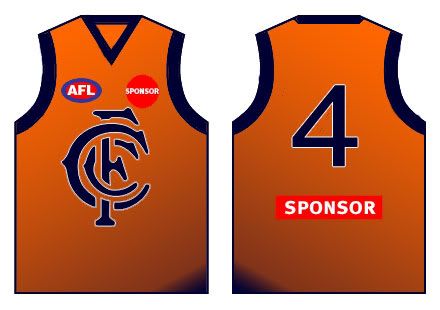
Hell, let's go for a deep orange jumper with navy blue monogram and number, navy blue shorts with orange detail. The monogram has to be bigger and bolder, more in the style of the 1927-1997 one, but bigger again. But not huuuuuuge like the massive one.
Can someone mock that up for me?
Camelboy came up with this:

My version harks back to our history, from the forming, by Sir Redmond Barry, and the reason we were called The Blues to begin with, too.
The only problem is that the colours are Telstra's corporate colours.
Alternative strips have the web jumping as fans clash over tradition[/quote]
Verbs came up with this one, which I also like:
So there you go, I've gone back through the first 24 pages (of 25) to show you what I think would work.[/i]