johntall wrote:
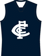
Rumour has it that the current "circumcised" monogram that replaced the "notches" monogram was instigated by a board member keen to "modernise" the corporate logo. It was done during a dark period of Carlton's history, and was nothing more than a desperate act to look as though the committee was actually doing things. The process involved getting out a ball point pen and filling in the offending notches. No designers were engaged. No research gathered. Just a desperate act by a self important official. Last year I spoke to a Carlton big-wig and he told me that the "notches" monogram remained the favoured version, but fact was we were 'stuck' with the current monogram. He encouraged me, and supporters, to contact the big man himself and push for restoration of the "notches" logo.
I contacted Ian Coutts about this very issue back in February 2006.
I created a thread about this at the time in which 61 people preferred the notched/serifed logo, compared to 11 people who like the current version.
Ian Coutts got back to me with this rationale behind the design:
Ian Coutts wrote:
Thanks for taking the time to contact the Carlton Football Club in relation to the new CFC logo and your thoughts on this. As you are well aware in your position as a Graphic Designer everyone has an opinion on such matters and it is very rare to find everyone agree. In regards to the new logo it is part of the campaign to reinvigorate the Carlton brand in the market place. The logo is a much cleaner logo and is in keeping with the objectives of the new promotional campaign and positioning of the Carlton Football Club. The laurel wreath logo is still used by the Club for official documents including the Annual Report.
You may have seen the new TVC that features the logo and the "Something Blue" campaign, this was launched on free to air television last weekend. This is a major campaign that is the result of a comprehensive study on the Carlton brand and where we are positioned and where we would like to be positioned in the market place.
In summary our research indicated that a radical change was needed to the way in which the Club had been marketed in recent years. The new campaign is based around the following 6 key attributes:
* youthful
* stylish
* innovative
* unique
* caring
* making a statement
The campaign highlight's Carlton's key strengths and is designed to appeal to existing and new audiences
I trust this provides you with a brief understanding of the decision behind the introduction of the new logo and look forward to your continued support of the Carlton Football Club.
Kind regards,
Ian Coutts
General Manager - Communications
My professional opinion is that the logo redesign was a butchered job and the result is an unbalanced and ugly logo. The feedback on the design brief from Ian Coutts above does nothing to change this. It seems that this is the consensus on TC from most of these 'bring back the notches' threads.
Maybe we should create a final sticky poll to get TalkingCarlton's official position on the logo? Then we could craft a letter on behalf of TC, letting the CFC know our official position on whether the logo is liked or disliked by the majority of Blues supporters.